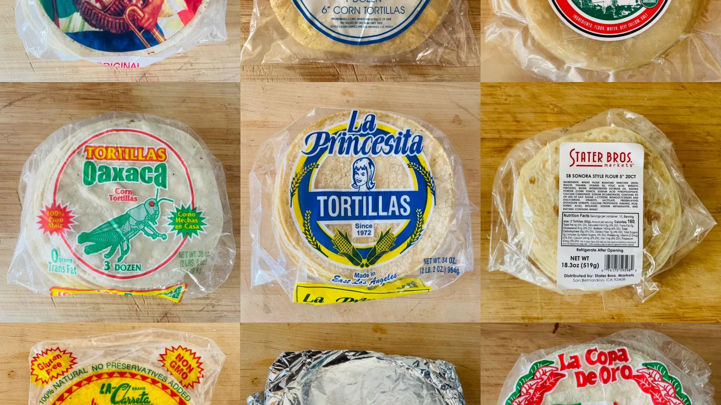
Willfully plain, wondrously ornate and puzzlingly medicinal. The following six graphic design contestants for the 2023 Tortilla Tournament run the gamut from basic to baroque, with at least one composition leaning into the inexplicable. (Someone please check in on the designers at Amazon to see if they're okay; they may need air conditioning.)
In my inaugural design critique for last year's #TortillaTournament, I noted that tortilla packaging doesn't generally get the same design love as potato chip packaging, which can inspire cult followings. But this year's tortilla contenders suggest that the tide may be turning, with package designers doing interesting things with color and pattern, as well as integrating references to the Los Angeles urban landscape into their colorful poly bags.
Then, of course, there's Amazon.
Let's take a look:
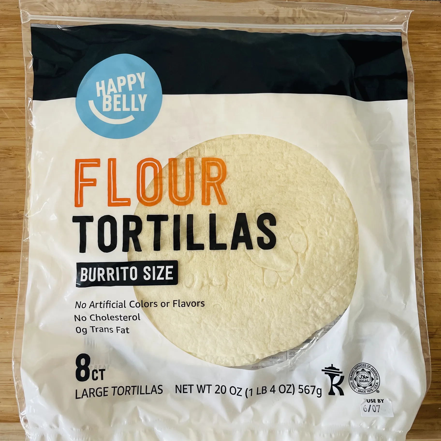 Oh, Amazon. Do better. Photo by Gustavo Arellano
HAPPY BELLY
The ubiquitous Amazon has been in the food business since 2017 when it acquired Whole Foods and now runs a chain of (struggling) cashier-less groceries called Amazon Fresh. As part of the push into groceries, they have developed a store brand called Happy Belly, which features graphic treatments that feel wildly unhappy.
Their tortilla package design deploys the pharmaceutical aesthetics reminiscent of dietary supplements and Vitamin Water: black and white color treatments with bold, sans serif fonts laid out in efficient but uncreative straight lines across the bag. Unlike Vitamin Water, however, this package doesn't have the benefit of containing colorful sugar water. Instead, it frames a sad flour tortilla that looks pastier than Jeff Bezos' skull. Thanks, but I think I'll stick to Wonder Bread since nothing about this bag feels tortilla.
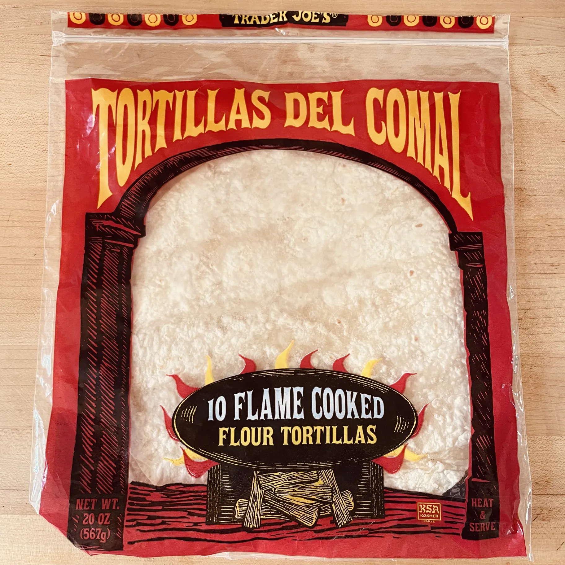
It's nice to see Trader Joe's making an effort with their tortilla packaging. Photo by Carolina A. Miranda
TORTILLAS DEL COMAL
Since we're on the subject of corporate tortillas, let's move on to Trader Joe's. Their Tortillas del Comal show that, unlike Amazon, the TJ's design office tries to put some elbow grease into packaging. Their tortillas are framed by a bright fireplace rendered in black and red whose hand-tooled aesthetic evokes Mexican woodblock prints of the early 20th century. At the bottom of the bag, a graphic of burning logs and licks of flame advertises "10 Flame Cooked Flour Tortillas." Do I believe that these tortillas, the color of rice cakes, have been anywhere near a flame? Hell, no. But the design at least makes an attempt at creating something warm and cozy.
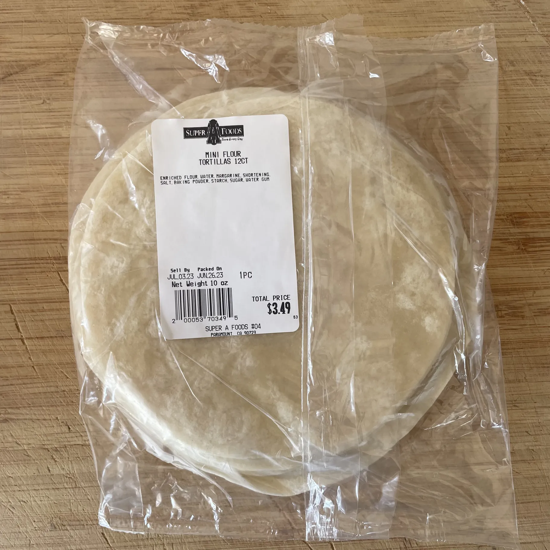
Straightforward and utilitarian works for Super A Foods. Photo by Gustavo Arellano
SUPER A FOODS
The pharmaceutical look may not work for tortillas, but the utilitarian approach does. At the Super A Foods supermarket chain, the only thing decorating your clear plastic tortilla bag is a price sticker with the market's logo and a barcode. These aren't fancy. They're workaday tortillas, the sort that will likely be consumed as soon as you get them home, hopefully with some queso fresco and a dollop of salsa verde.
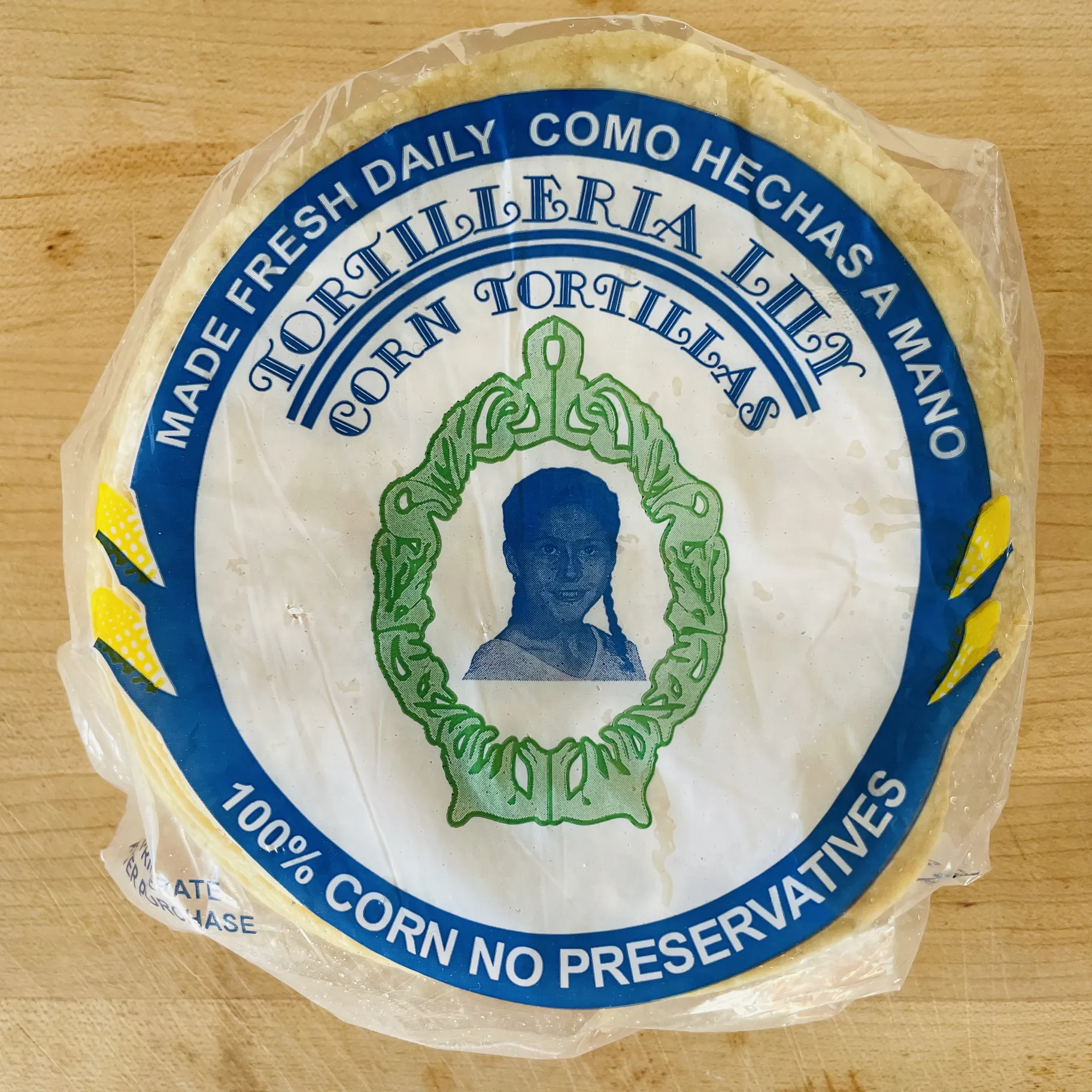
Tortillería Lily goes for a homespun feel with an image of the owners' daughter, who is now in her 40s. Photo by Gustavo Arellano
TORTILLERIA LILY
You know a tortilla means business when it features a photo of a family member on the package. That's certainly the case with San Diego's Tortillería Lily, which displays a black and white image of the owners' daughter as a young girl (Lily is now in her 40s) framed by a green, vaguely Art Nouveau pattern. Above that, a classic serif font reads "TORTILLERIA LILY" in all caps, encased in a bright blue circle. This design is part of a genre in tortilla package art that relies on photos of the owner's young children to convey "homemade," most famously as used by Diana's Mexican Food of Gardena. Tortilleria Lily's entry is a bit cluttered but it feels full of love — just like the best tortillas.
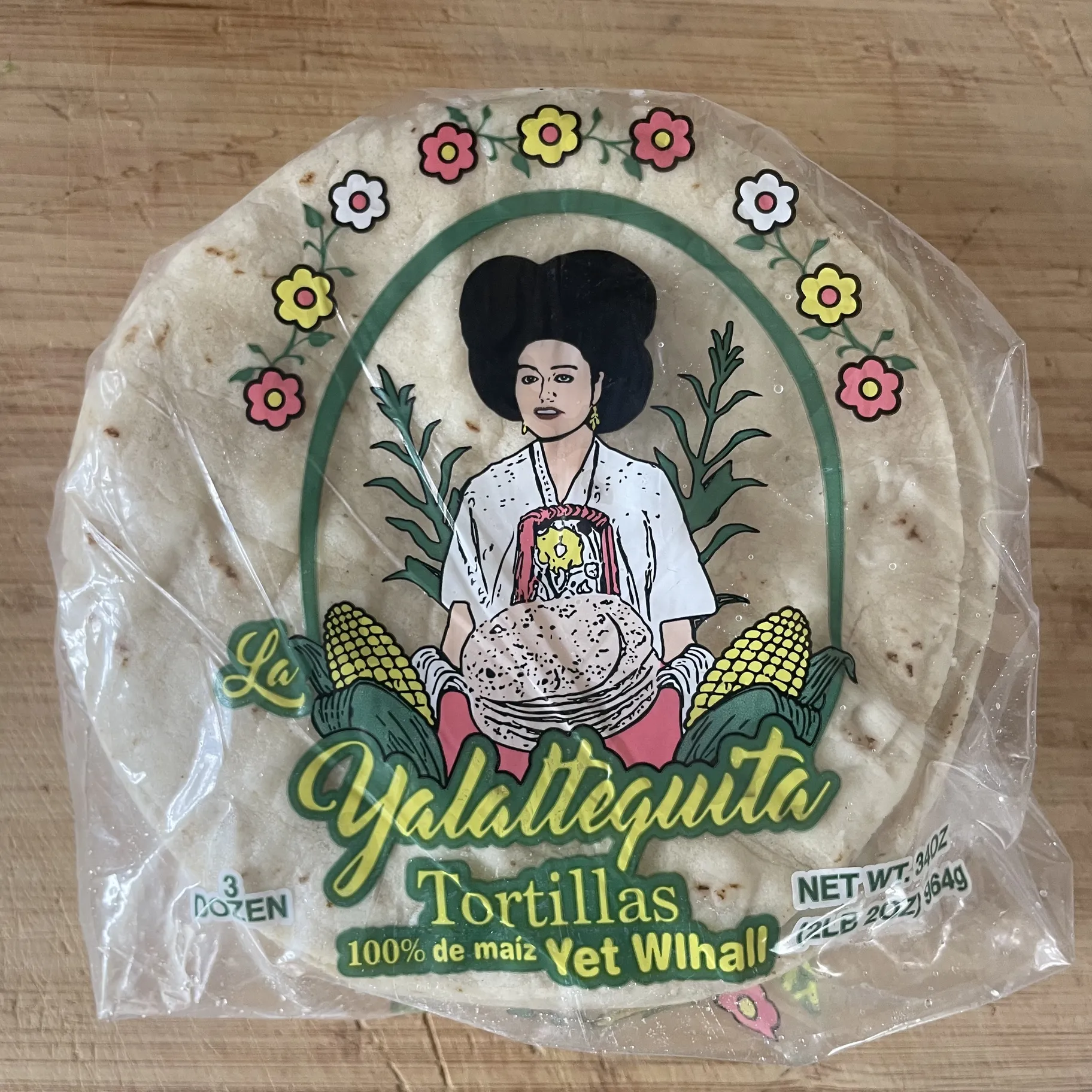
La Yalaltequita brings the color to its tortilla package design. Photo by Gustavo Arellano
LA YALALTEQUITA
La Yalaltequita, a restaurant, bakery and tortillería on Venice Boulevard in Mid-City, brings Oaxacan Indigenous traditions to its package design. The bag for its corn tortillas features a woman in traditional Yalalteca dress, a Zapotec community in and around the town of Yalálag in the mountainous Sierra Norte. The woman, who wears a traditional huipil and the large, black head wraps that are typical of the area, is encircled by bright flowers and two ears of corn. It's a winning design for its bold use of color — pinks, yellows and greens — that gets away from the more common red, white and green.
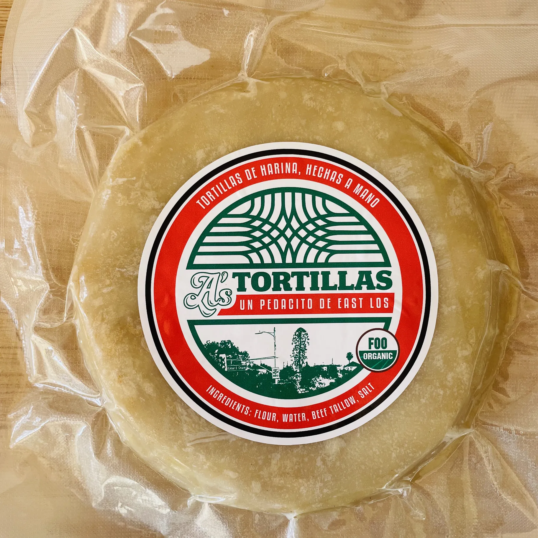
The packaging on the tortillas from A's BBQ is top notch. Photo by Gustavo Arellano
A'S BBQ
A's BBQ in East Los Angeles now produces tortillas and if they're a fraction as good as their brisket or their mac and rajas, then they're probably excellent. Also excellent: the design of their packaging. Yes, they go traditional with the tricolor palette. But their design is not only clean and well executed, it is wonderfully specific to Los Angeles. Occupying the bottom half of a bold red circle is an image of El Pino, the bunya tree in Boyle Heights that was a minor character in Blood In, Blood Out and now has a cult following. At the top is a lattice pattern inspired by the steel arches that span Whittier Boulevard in East L.A. The tortillas are organic but in lieu of the typical USDA logo, their package reads, "FOO ORGANIC." The foos at A's gets an A+ from me.

